Page 108 - THE MARKET WHISPERER
P. 108
106 PART 4 - The Char t: Money ’s Footprint

producers request a simple chart prior to going on air that viewers can
understand. You’ve seen it, you’ve made this chart’s acquaintance, and
now you should forget it altogether.

Point and Figure Chart

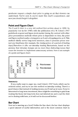
The X and O chart is a very old method first written about in 1898. Its
popularity rose in the 1940s with the publication of A. W. Cohen’s 1947
guidebook on point and figure stock market timing. By contrast with other
price presentation methods where price is dependent on time, the point
and figure method marks a rising price as X and a dropping price as O. This
method chiefly serves long-term investors, since it presents prices over
just one timeframe (for example, the closing prices of a period of trading
days).Therefore it sifts out intraday trading fluctuations, based on the
premise that intraday changes are no more than distracting noises that
cause the investor to implement unnecessary actions. Here is an example
of a point and figure chart:

Summary:
   If you really want to anger me, read Cohen’s 1947 book, which can be

ordered online, and try to use this method on intraday trading. There’s a
good chance that instead of making money, you’ll end up in tears. If you’re
interested in long-term investment, there might be something to gain from
reading the book, but long term does not interest me and is not the field
we’re dealing with here, so it will not be discussed further.

Bar Chart

Now we’re moving up a level! Unlike the line chart, the bar chart displays
a good amount of useful information and is the most common chart in

