Page 107 - THE MARKET WHISPERER
P. 107
THE MARKET WHISPERER  10 5

Line Chart

This is the simplest chart, commonly recognized by the public and used
most often in financial media. A line chart is created by connecting all the
closing prices (the last trade price at the end of the day) over a certain
period. These are plotted onto the chart, and a line is drawn connecting
them. This is the simplest way to present prices, but as we will see later
on, it is insufficient, as the information it provides is relevant only to the
stock’s closing price. For a trader, it lacks the important data such as open
price, intraday high price (the peak price for each day) and the intraday
low price. This is information that the trader cannot be without.

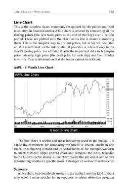
AAPL – 6-Month Line Chart

   The line chart is useful and most frequently used in the media. It is
especially convenient for comparing the prices of several stocks in one
chart, or comparing a stock and its sector index. If, for example, we wish
to check a stock’s Apple (AAPL) chart and compare the AAPL behavior
to the hi-tech sector stocks, a line chart makes the job easier and allows
determining whether a specific stock is stronger or weaker than its sector.

Summary:
   A nice chart, but completely useless to the trader. I use this kind of chart

only when I write articles for newspapers or when television program

